Alert
Callout with a title, a description and an optional icon.
1 pageOpen PDF ↗
alert-example.tsx
import { Block, Document, Page } from "@ui-registries/pdf";
import {  Alert,  AlertDescription,  AlertIconCheck,  AlertIconInfo,  AlertIconWarning,  AlertTitle,} from "@/components/pdf/alert";
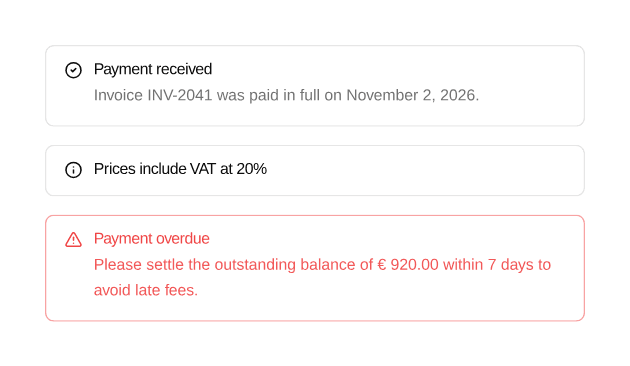
export default function AlertExample() { return ( <Document> <Page className="gap-6 bg-background p-10 text-sm" size={{ width: 420 }}> <Block className="gap-4"> <Alert icon={<AlertIconCheck />}> <AlertTitle>Payment received</AlertTitle> <AlertDescription> Invoice INV-2041 was paid in full on November 2, 2026. </AlertDescription> </Alert> <Alert icon={<AlertIconInfo />}> <AlertTitle>Prices include VAT at 20%</AlertTitle> </Alert> <Alert icon={<AlertIconWarning />} variant="destructive"> <AlertTitle>Payment overdue</AlertTitle> <AlertDescription> Please settle the outstanding balance of € 920.00 within 7 days to avoid late fees. </AlertDescription> </Alert> </Block> </Page> </Document> );}Installation
Terminal
npx shadcn add https://ui-registry.com/r/pdf/alert.jsonUsage
tsx
import {  Alert,  AlertDescription,  AlertIconWarning,  AlertTitle,} from "@/components/pdf/alert";
<Alert icon={<AlertIconWarning />} variant="destructive">  <AlertTitle>Payment overdue</AlertTitle>  <AlertDescription>    Please settle the outstanding balance within 7 days.  </AlertDescription></Alert>
An alert never splits across two pages.
Variants
variant | Description |
|---|---|
default | Card background, muted description |
destructive | Destructive border and text |
Icon
react-pdf has no CSS grid, so unlike shadcn/ui the icon is not the first child but the icon prop: it is placed in a left column, next to the title and description.
Three icons are included: AlertIconInfo, AlertIconWarning and AlertIconCheck. They follow the alert variant (foreground or destructive color) and take a size-* or text-* class to override the size or color:
tsx
<Alert icon={<AlertIconInfo className="text-blue-600" />}> <AlertTitle>Prices include VAT at 20%</AlertTitle></Alert>Any Svg works as an icon.